
Using GIS for public health in Tanzania
Ben Risley learned QGIS to map vaccination rates, survey progress, and radio listenership for the Afya Yako project.
While working on the Afya Yako public health misinformation project at the Economic and Social Research Foundation, I had many opportunities to learn new and important skills. During this stage in Afya Yako, they had baseline data from their sample of health facilities in Tanzania. The research team had a lot of raw data and it gave me a chance to practice data presentation. Using QGIS mapping software I was tasked with mapping the vaccination rates in their list of health facilities. I was given a crash course in QGIS, which gave me an introduction to the different tools and interfaces of QGIS. I was excited to start working on the first mapping project so when I got home that night I started researching independently. My first baseline resource was a video describing the process of making “professional grade maps” in QGIS. The product of this research is shown to the left. I was informed that this map does not conform to many of the generally accepted mapmaking guidelines. However, it was really helpful to engage in the trial-and-error process in the initial stage of this project. The video taught me how to add and remove features, change the colors, implement an inset map, and many more useful tools.
This initial map includes too many unnecessary features but I had more opportunities to to work with QGIS. My next project was a map displaying the number of surveys collected from each of the health facilities in the sample. This map would serve as a progress report for the researchers at ESRF and could also highlight problem areas where missing surveys indicate a procedural problem. The final product is shown to the right. It does not show any clear problem areas but does give a general synopsis of the progress at this stage of survey collection. The Afya Yako research team gave me a lot of encouragement while I was working on these projects. They provided feedback about how I could improve my work and encouraged me to come to them with any questions.
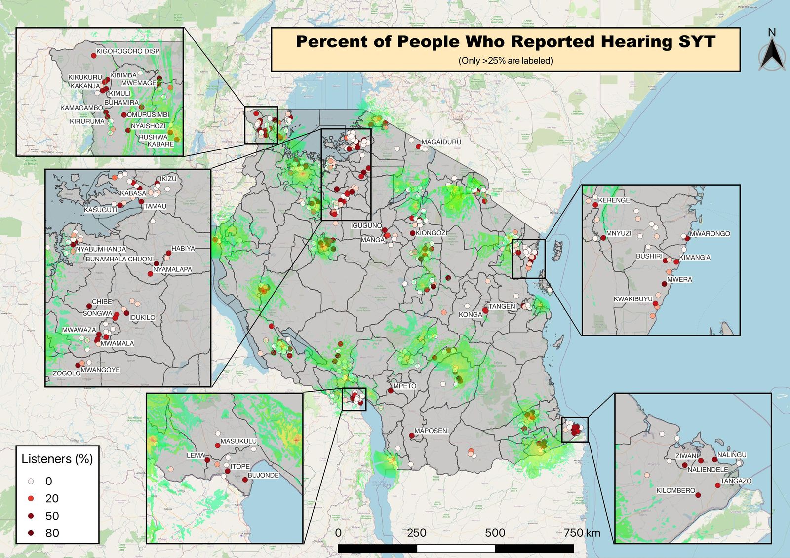
My most difficult task in QGIS was a map showing the percentage of survey respondents who listened to the treatment radio program. My challenge was to display this data (listener percentage) alongside the treatment and control radio station transmission boundaries. This kind of map uses raster data files for the transmission boundaries and I found the trial and error process especially helpful with this project. The first complete iteration of this map is shown to the right. I attempted to list the names of locations with high listening percentages that might not have been in the range of the radio transmitters. This map is difficult to interpret and with some suggestions from the research team, I removed the inset maps specific facility names. Instead, I labeled radio stations that these transmitters represented and adjusted the color scheme to more accurately communicate the message of the map. The most recent version of the map is shown to the right. I think the comparison between this product and the first map I made using a YouTube video, shows a lot of improvement in my knowledge of QGIS software. I’m grateful for the research team’s guidance and support as I worked through challenges and became well-practiced in this skill. Becoming proficient in QGIS stands out as one of the key accomplishments during my time at ESRF.
